
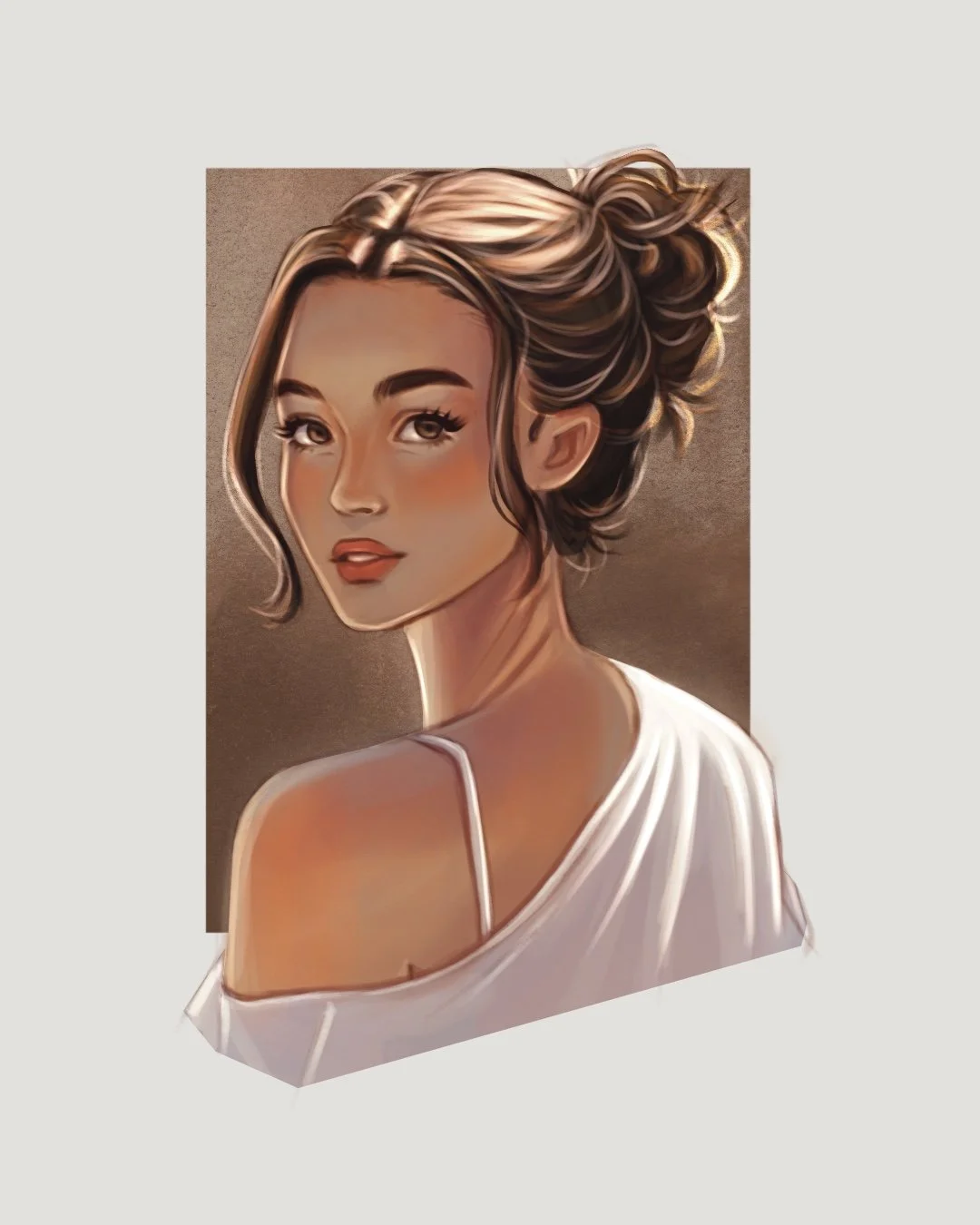
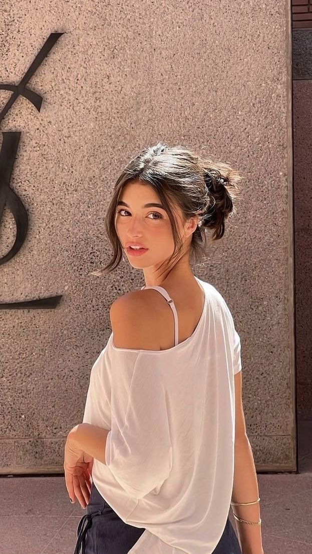
Art Process Breakdown
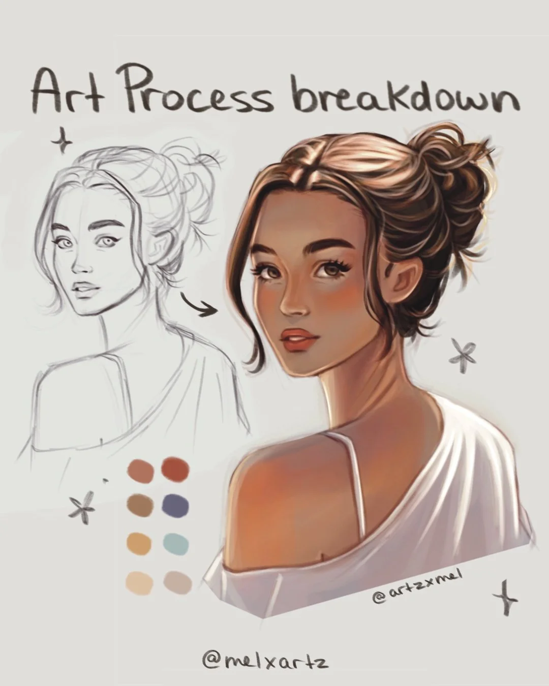
Every illustration I make usually follows the same process. Here’s how I built this piece from sketch to final render!
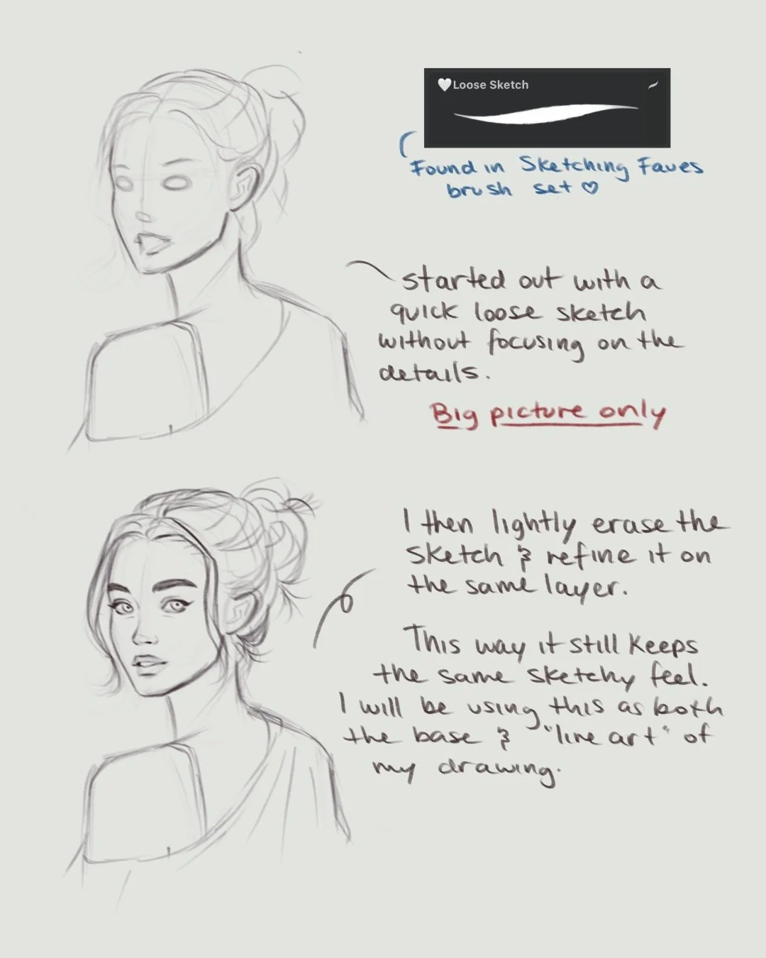
1. Sketch
I always start with a quick, loose sketch just to get the basic shapes and flow down without worrying about details.
Once it looks right, I lightly erase and refine it on the same layer with the same brush — since I don’t use line art, this becomes part of my painting’s base and still shows up on my finished piece.
Tip: set the layer to Multiply, and it will show up once you add color.
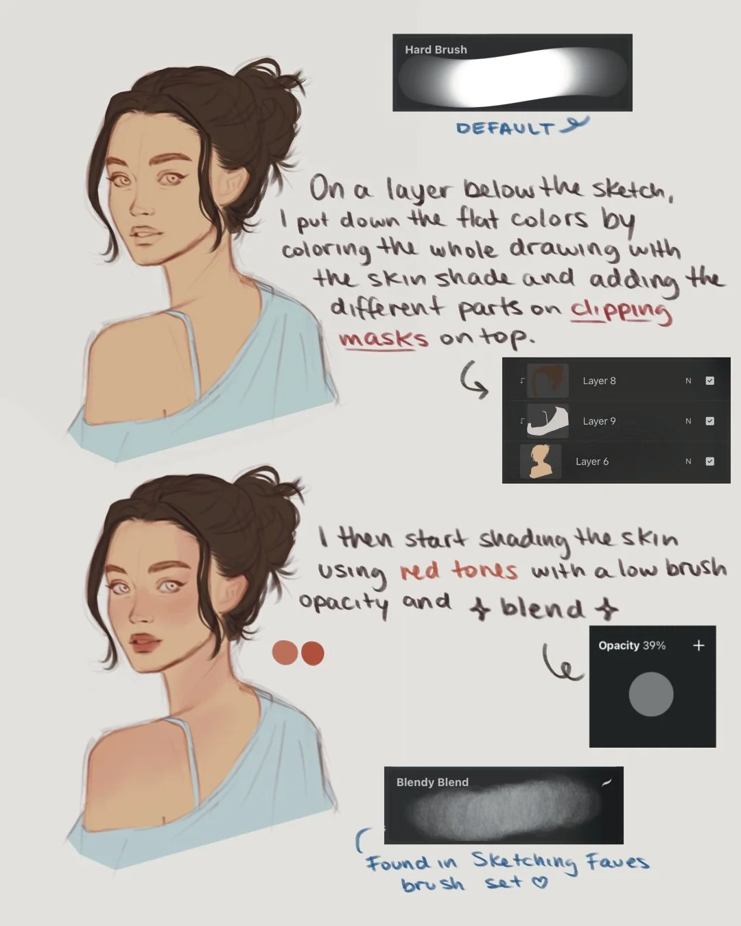
2. Base Colors
Next comes color blocking.
I fill in the flat colors on a layer below the sketch, sometimes using a few clipping masks to test different color combinations.
Once I like what I have, I start shading the skin — adding soft pink and red tones to the cheeks, eyes, lips, and shoulders to bring life and warmth into the piece.
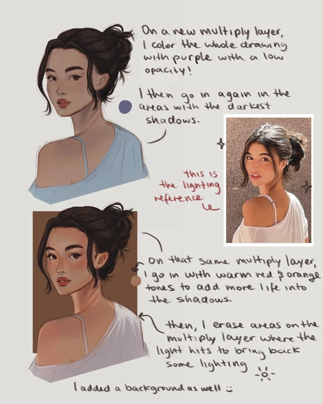
3. Shadows
Create a new layer and set it to Multiply. On this layer, I’ll start building the main shadows based on where the light is coming from.
Use a warm or cool tone depending on the lighting reference.
Add soft shadows to define the forms and create depth.
Erase areas where the light hits directly to let the base colors show through.
Keep it subtle, this layer sets the foundation for your lighting.
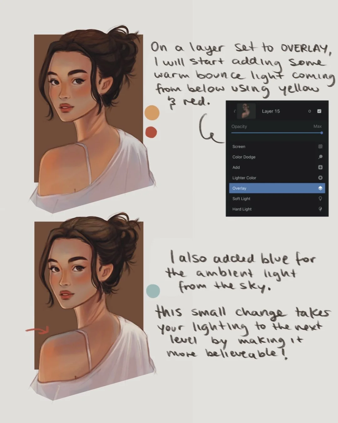
4. Adding Direct and Ambient Light
Now it’s time to start adding in the lighting!
Create a new Overlay layer and set to Clipping Mask over your base colors
Add in:
💛 Yellow for the warm sunlight bounce.
🧡 Red-orange for soft warmth on the cheeks and lower face.
💙 Soft blue for the cool ambient light from the sky.
Build the glow gradually.
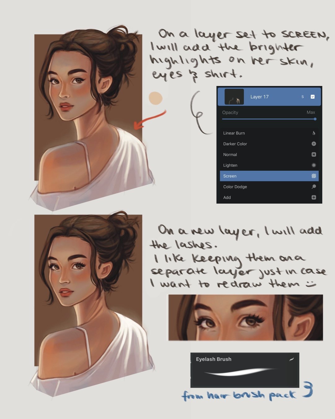
5. Add Highlights
Next, I create a Screen layer and add the first round of highlights — focusing on areas where the sun hits directly.
I usually do this using a soft orange or yellow shade, not too bright or saturated.
Tip: apply Gaussian Blur to this layer at 2-3% to add a soft, dreamy glow✨
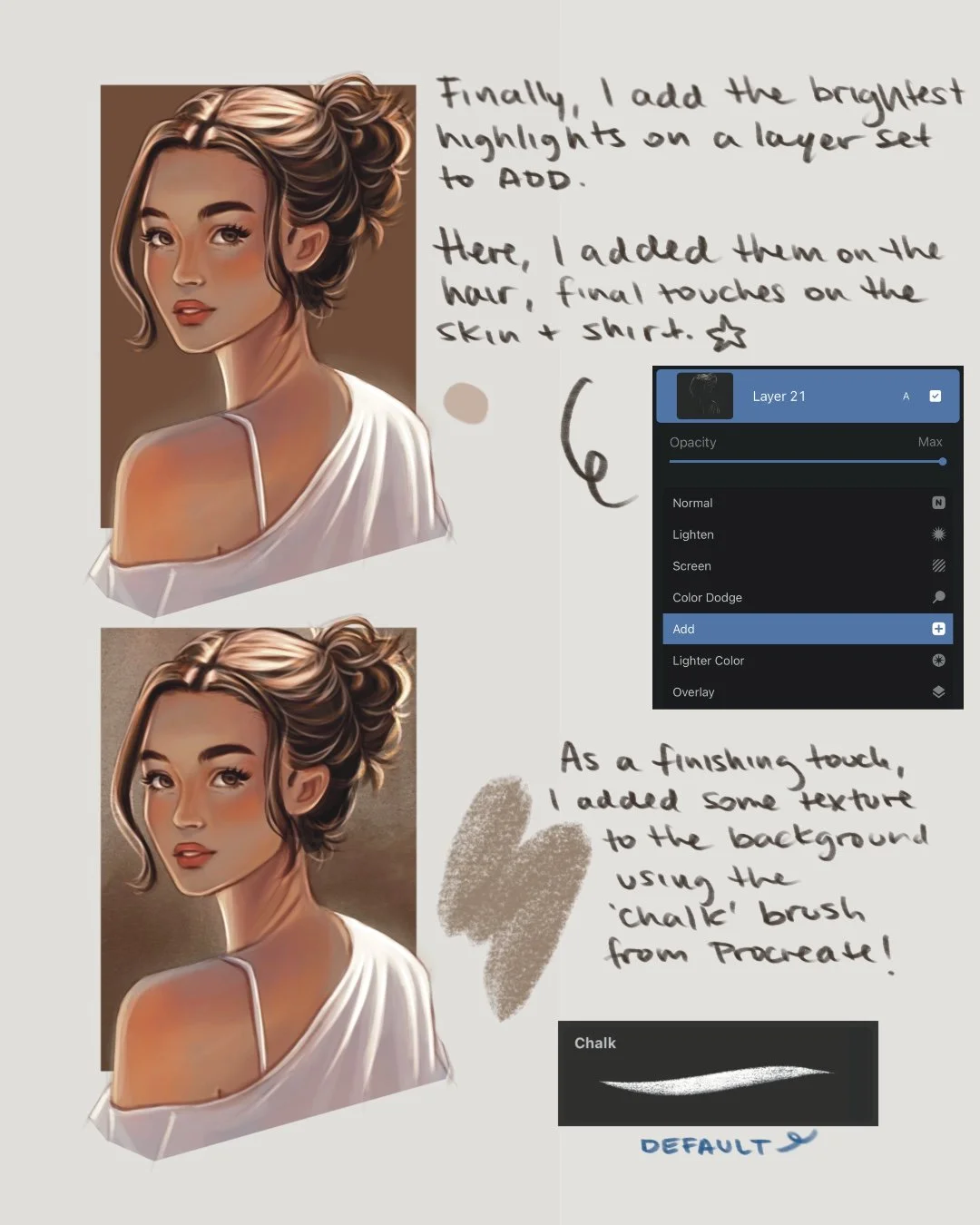
Then, on a final layer set to Add, I place the brightest highlights and rim lighting using a lighter, desaturated version of the same tone used before.
This is honestly my favorite part — it makes the drawing pop and helps separate the character from the background.
I added these highlights to the top of her head since that is where the sun is hitting most and on her shirt as well. I also like adding a few flyaways to make the hair feel more natural.

🖌️ Brushes used
Loose Sketch - Sketch Brush Set
Blendy Blend (FREE) - Blendy Blend
Round Shading Brush - Rendering Brush Set
Eyelash Brush - Hair brush Set
💡 Quick recap
Start with your sketch and set to Multiply
Add flat colors on a layer below your sketch
Build shadows on Multiply
Add warmth and ambient light on Overlay
Place highlights on Screen and Add ✨
🎨 Want to learn more about lighting?
Check out my Lighting Tutorial on YouTube for a full walkthrough on how I approach different lighting scenarios! You’ll see how I layer everything in real time and add lighting in Procreate.
Watch the tutorial:
Subscribe to my email newsletter to receive your 5 free procreate brushes, plus occasional updates and resources from me!
Check Out My Latest Youtube Video!